A lot of people love to say that Target is superior to Walmart, but truthfully? They sell VERY similar products and carry a lot of the same brands.
So why has Target accumulated such a following over the years?
Despite selling similar products, shoppers have noted a difference in experience – whether that be the trendy designs, wider aisles, more spacious displays, or generally elevated aesthetic.
In the same way, other apartments may be offering similar products, but your high-converting multifamily website design could be the differentiator that makes a solid first impression and turns a website visit into a lease.
Is your website easy to use?
Helpful and clear?
Professionally designed?
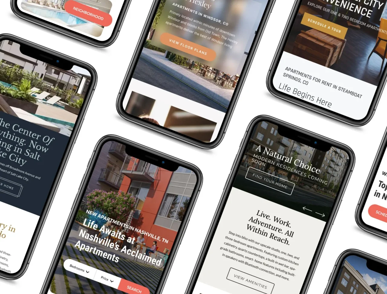
If you want to create a website experience that turns visits into leads, take a look at our multifamily website designs.
With years of experience and countless case studies to prove the data, we’re excited to share these 5 major features that will take your site to the next level.
Let’s get into it.
5 Features You Need for High-Converting Multifamily Website Design
1. Provocative Copy
Everyone has “luxury” apartments with “modern” finishes in a great location, but the best copy goes deeper than that. It answers an even biggest question: Why should someone care?
Once you understand what your audience is truly looking for and you know their pain points you can write copy that positions your apartment as the solution.
Say you’re trying to market some highly-amenetized apartments near historic downtown. Below, you can see how specification of copy can help you speak more directly to your audience.
Weak: Luxury apartments near the Flatirons
Strong: Wake up to Flatiron mountain views every morning.
The way you speak to your audience should be extremely customized, directly addressing their wants, needs, and concerns. As they say, people don’t have short attention spans, they have short consideration spans.
Get right to the point and show your audience that you have what they’re looking for, and you’re unlike any other option.
2. Multi-Step Forms
Nowadays, every multifamily website design has a contact or lead form. But the best ones – the high-converting multifamily website designs – take it one step further (literally).
A standard form asks all of the questions at once.

A multi-step form, on the other hand, only asks a few questions at a time. The key here is to start with questions that show your unique interest in the user (often their preferred move-in date and bedroom-count).
After the user completes step one, they may feel more comfortable sharing their personal information, as you’ve already indicated a personalized interest in their needs and wants.

3. Live Pricing & Availability
When it comes to multifamily websites, you absolutely need to be sharing real-time pricing. For a potential resident, cost is often one of the most important deciding factors when searching for an apartment that will fit their needs.
If the price is right, they might take the next steps. If the price is ambiguous or unclear, they might not spend any additional time poking around.
That’s why pricing integration software is crucial to high-converting website designs. It pulls pricing front and center, so you’re website visitors have all the information they need to make a choice.
Bluprint websites utilize Rent Fetch, a custom plugin that shows live pricing and availability, for this very reason. It’s easy to install and functional with a number of property management software.
4. Clear Next Steps
If you’re asking your website visitor to do too many things, they may skip all of it. As tempting as it may be, try not to distract your visitors with a leasing pop-up, a phone number callout, an ‘apply now’ button, and a ‘schedule a tour’ button. With all of these actions vying for their attention, your website visitors may be confused about next steps or get overwhelmed and leave.
Consider simplification.
Is your main goal to increase tours? Increase contact form submissions? Collect online applications?
Tailor your multifamily website design so it only encourages one major next step. You can still offer those other callouts, but there are more strategic ways to place them on your site so they don’t overpower the main focal call to action.

5. Good UX
The best apartment website design feature is the one that is easy to use.
You could create the fanciest layout, the most innovative elements, and the most beautiful design, but that won’t mean anything if your website visitor can’t figure out how to use the site.
When creating your online presence, it’s crucial to consider how things will appear to an outside user.
Do the website load quickly? Is the menu easily accessible? Can they find your floor plans?
Designing for UX is a non-negotiable in website design.
Why Multifamily Teams Choose Bluprint
High-converting multifamily websites require more than strong visuals — they demand thoughtful UX, SEO-first structure, and a deep understanding of renter behavior. Bluprint specializes exclusively in multifamily websites, helping teams create digital experiences designed to attract, engage, and convert.
LEARN MORE ABOUT BLUPRINT’S MULTIFAMILY WEBSITESLevel-Up with a High-Converting Website Design
With all 5 of these high-converting multifamily website design features, you’re to see an increase in conversions, engagement, and interest. However, we understand that a website overhaul may be a bit overwhelming.
Bluprint offers templated apartment websites created specifically for multifamily marketing. Browse our apartment website theme options today, and get in touch to learn more.
FAQS
High-converting multifamily web design focuses on guiding renters toward action. Clear calls-to-action, fast load times, mobile-first layouts, and easy access to floor plans and availability all play a role. When these elements work together, apartment websites are more effective at turning traffic into tours and qualified leads.
The biggest difference is structure. Well-performing apartment websites are designed around renter behavior, not just aesthetics. Thoughtful navigation, focused landing sections, and friction-free contact options make it easier for prospects to take the next step, while poor layouts often create drop-off points.
Improving conversions often starts with evaluating layout, mobile experience, and CTA placement. Many operators see better results by adopting a proven multifamily web design framework rather than rebuilding from scratch. If you want inspiration or examples, you can explore our apartment website designs to see how Bluprint structures sites for leasing performance.